Why I design in the browser
For most of my career the order was fixed: design in a drawing tool, get sign-off, then rebuild the whole thing in code. The mockup was the "real" design and the website was a copy of it. Over the last few years I've flipped that around. I still sketch, but the first version anyone sees is a page in a browser. The browser is where the work ends up, so it's where I'd rather make decisions.
This isn't an argument against design tools. It's an argument about where the truth lives.
A mockup is a photograph
A static mockup captures one moment: one screen width, one amount of text, one font that happened to load, one state where nothing went wrong. It's a photograph of a website that doesn't exist yet.
Real pages are messier. Headlines run long. Names have diacritics. Someone opens the page on a 320px phone with the text size turned up. A photograph can't tell you what happens next, and "what happens next" is most of the job.
The design is not the picture of the thing. The design is how the thing behaves when the content, the screen and the person are all different from what you expected.
When I design in the browser, those questions answer themselves early, while they're still cheap. A title that wraps badly shows up on the first draft, not in QA two weeks later.
What changes in practice
Three things, mostly.
- I start with content, not layout. Real text goes in first, even if it's rough. Layout follows the text, not the other way round.
- Type and spacing become tokens immediately. Instead of nudging pixels, I adjust a handful of custom properties and watch every page change at once.
- Clients review something they can click. Feedback gets more specific. "This feels slow" is more useful than "can the button be bluer".
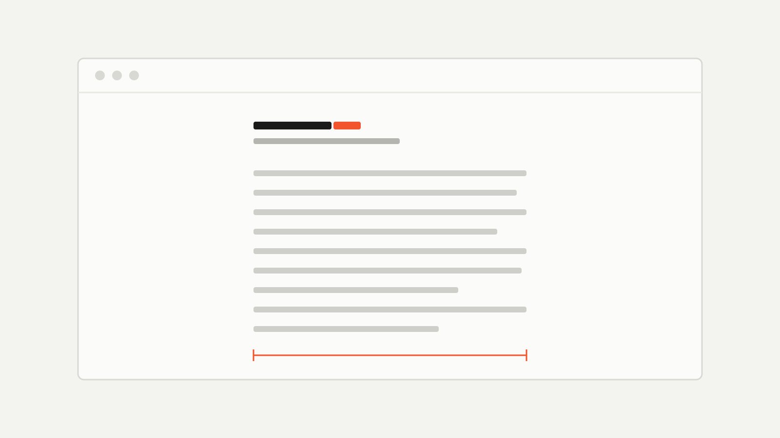
Here's roughly what those tokens look like at the start of a project. Nothing clever — just decisions written down in one place:
:root {
  --text: #1a1a1a;
  --muted: #6e6e69;
  --measure: 36rem; /* ~65 characters */
  --space: 8px;
}

.column {
  max-width: var(--measure);
  margin-inline: auto;
  padding-inline: calc(var(--space) * 2.5);
}
Change --measure and the whole site reflows. Try doing that across forty artboards.
Where drawing tools still win
I don't want to oversell this. Drawing tools are better for some things, and pretending otherwise just makes the browser-first approach sound like dogma.
| Task | Drawing tool | Browser |
|---|---|---|
| Exploring ten directions quickly | Better | Slower |
| Illustration, brand marks | Better | — |
| Responsive behaviour | Guesswork | The real thing |
| Type at actual sizes, on real screens | Close | Exact |
| Handing off to developers | A translation step | Nothing to hand off |
My rule of thumb: diverge in a drawing tool, converge in the browser. When I'm still asking "what could this be?", I sketch. Once I'm asking "does this work?", only the browser can answer.
Performance is a design decision
The other thing a mockup can't show you is weight. A page that looks calm in a static frame can still ship two megabytes of scripts and take four seconds to settle on a phone.1 When I build as I design, every addition has a visible cost. Adding a web font means seeing the flash. Adding an animation means feeling it on a slow device.
That changes what I reach for. Fewer fonts. System fonts for code. No carousel, because I'd have to build the carousel. It turns out a lot of design restraint is just having to live with your own decisions.
Getting started
If you want to try it, you don't need a framework. A single HTML file and a stylesheet will do:
<!doctype html>
<html lang="en">
  <meta charset="utf-8" />
  <meta name="viewport" content="width=device-width, initial-scale=1" />
  <link rel="stylesheet" href="tokens.css" />
  <main class="column">
    <h1>Start with the words</h1>
    <p>Then make them easy to read.</p>
  </main>
</html>
Open it, resize the window, paste in real content, and change one token at a time. Within an hour you'll know more about how that page behaves than a week of mockups would tell you. If you'd like the long version of the argument, Jeremy Keith's Resilient Web Design is still the best thing written on it.
I'll keep using drawing tools. I'll just stop treating their output as the finished thing. The finished thing is a page in a browser, and the sooner I'm looking at one, the better my decisions get.
- Drawing tools increasingly let you preview prototypes on a phone, which helps with feel. It still doesn't tell you how the production page will load. ↩